BenzNote Hex Grid Index Cards
As submitted, this article did not seem to be a proper fit for any of the sections of Critics’ Corner. The editor ultimately decides to run it in Other People’s Toys as it is something that is not a published Traveller product and could be “mined for ideas”.
This article originally appeared in the January/February 2023 issue.
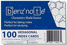 BenzNote Hexagonal Index Cards.
Zimation, LLC http://www.benznote.com
100 Cards, 4”×6”
US$7.00/UK£6.50 (via Amazon.com/Amazon.co.uk)
Occasionally Twitter has it’s uses. @clownf1st, I’m sorry, that’s the best credit I can offer, I did ask, had spotted BenzNote hex grid index cards (@mybenznote) and wondered if they’d be suitable for subsector maps. I’m not sure why as TravellerMap is so wonderful, but I couldn’t resist finding out for myself. They are indeed suitable for subsector maps!
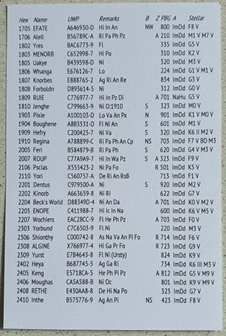 For £6.50 (Amazon.co.uk, $7.00 Amazon.com) you get 100 4”×6” (10.16×15.24cm) index cards with the advertised hex grid on one side. Half an
inch from hex corner to hex corner or about 1.1cm from hexside to
hexside so you actually get an area of hexes 10×13 on a card which gives
you a subsector and a little bit of room for a key or a small amount of
text. (School geography lessons would also insist on a title and a scale
as well.) The hexes are oriented so holding the card in portrait
fashion, the top of the hex is flat – perfect for
Traveller! (The cards
are rotationally symmetrical so it doesn’t matter which way up they are
in either landscape or portrait orientation.) The reverse of the cards
is blank which is a bit of a shame as more hexes or perhaps lines for
text might have worked well but it’s still perfectly possible to
scribble notes on them if desired and they certainly allow free
sketching of an illustration, a bit of deck plan, planet surface or
building interior quite easily. I’ve tried them in a printer which
accepts A6 paper/card and it quite happily put a subsector on the
reverse of the card (see image right).
The cards themselves are not as thick as other 4”×6” cards I’ve bought in the past but they’re sturdy enough for the purpose and file neatly in an index card box or, in a small pack, would take an elastic band around them. The pack of 100 is about 2cm deep. They’re actually sold, as the name implies, as a chemistry study aid for notetaking or revision when drawing molecules. “Chemistry Made Easier” proclaims the cover sheet that accompanies the cards (see above). They come cellophane wrapped so there’s no storage with them. I imagine the makers – a Czech company I think – assume they’re going to be fairly ephemeral.
The heavy paper or thin card surface accepts ink pen, pencil and coloured pencil quite happily. The cards themselves are white and the hex grid is in a thin pale green. Perhaps black would have been more in keeping with a space theme, but actually I find them quite attractive. They immediately draw you into wanting to chart a bit of space. I’ve not tried it yet, but they would probably accept a very light glue (perhaps Pritt stick or a spray) if you wanted to paste something like a newspaper/magazine clipping or printed out image or something.
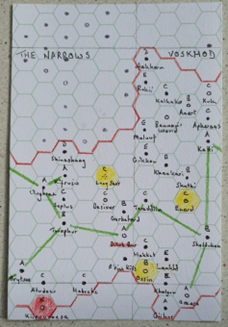
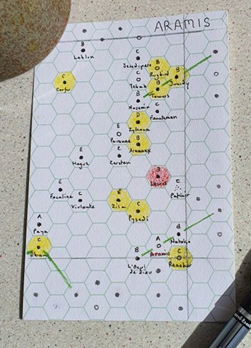 For subsector maps they work rather well. A filled circle
representing water available, an empty circle representing no water,
surmounted by a starport letter and with a world name underneath is
perfectly possible with a reasonably fine pen. My penmanship isn’t up to
much but a subsector isn’t too large to be frustrating or become a major
project so even I can live with the results. You’d be hard pressed at
the size to get a UWP on there as well, although at standard planet
densities there’s probably just about enough blank space in a subsector
to write them on wherever you found space if you really needed them and
didn’t mind a somewhat haphazard and busy look. I can see myself
printing hex numbers, names and UWPs in a list on the reverse of the
card. If you’ve the patience, there’s no reason these couldn’t be
handwritten as well. Colouring in hexes for Amber and Red Zones works
better than plain circles and Jump routes can be added if required.
Pencilling in the subsector boundaries gives a nice cartographic ‘edge’
to the subsector but may not be necessary depending on the effect you
want; particularly if you were just showing a specific local area rather
than a formal subsector. The example image doesn’t so much show a
subsector as the local area around Dilub Rou (Corridor 3208 A420573-F)
which is the Boys from the Baltic Star stomping ground right on the edge
of the Great Rift (see left). Placed in the ‘top left’ of a card, a
subsector would have two columns of hexes to the right and three rows at
the bottom for additional notes or a key. Alternatively, especially with
the subsector moved across and down a hex, worlds on the subsector
border can be shown (see Aramis, right).
You may be wondering what the need for this is with TravellerMap doing such an excellent job of showing off the grandeur of the Third Imperium and other places. Firstly, you may have created your own universe and although you can get TravellerMap to output your own creations relatively easily, this might be a quicker and simpler way of either referring to your worlds offline or offering handouts to players emphasising (or concealing) certain information. Players might like them to scribble down areas of interest which they can then keep to hand with a character sheet. Secondly, even in the official Traveller universe, there’s a certain homespun joy in ‘exploring’ a subsector this way that takes me back to what first drew me to Traveller in the first place. It’s easy for your eyes to skim over a subsector map in a book or on TravellerMap, but when you get your hands on placing the worlds and writing out their names, it’s all too easy to drift off in the imagination to the worlds themselves and their relationship to one another. It’s what Sunday afternoons were made for. In addition, it only takes a few minutes to create a bookmark that can travel with you through a few pages of a volume like The Spinward Extents and save you flipping back to the book’s map each time you arrive at a new world. Thirdly, it would be very easy to use these in a pure sandbox type of game where scouts – or others – were mapping as they went and there might be little in the way of clues as to which direction would be most ‘interesting’. (The referee’s siting of ‘start’ worlds on a larger sheet of hex paper might indicate where they were expecting exploration to take place.) The cards can easily abut one another with a very slight overlap to allow the mapped area to grow if larger hex paper isn’t available or the referee wants to keep things tight. This also makes it possible to, for example, show a subsector and the eight that surround it regardless of printed map ‘edges’ which would be difficult with paper sector maps and is more TravellerMap like in its flexibility. The cards are of such a size as well that laying them out on a, say, a pub table or other restricted gaming space would be much easier than a large poster of a sector. Assuming anyone still meets face-to-face!
Of course, astrographic mapping isn’t the only place that Traveller uses hex grids. It would also be easy to reproduce one of the regional hexes from Traveller5 on one of these cards and then offer further detailed, large scale, terrain maps zooming in as required. World Hex and Local Hex maps would need to be portrait, Terrain Hex and Single Hex maps need to be landscape. Again, they are just about cheap and cheerful enough to use these as quick and dirty handouts for players or for players to be making their own sketches. I shall certainly be tucking a handful into my rulebook when next at TravCon in case I want to make a note of a local area map or a local area star map during a game. For those who’ve seen the TravCon notnznoteebook template I created a while back, you’ll know there’s a small area of hex grid and an equal size of square grid on each page for an adventure, but they’re fairly limited.
I can’t help feeling it was a missed opportunity not to put either more hexes or lines or, perhaps even better, a square grid – deck plans! – on the reverse of the cards, but presumably that would have added to the cost and lined cards are certainly already available. I’d guess without bothering to look, square grid cards are too.
Of course, there’s no absolute need to use the hexes at all and the cards could simply be used for ordinary notetaking if desired. You could easily get a PC or perhaps a couple of NPCs onto a card without having to write too finely. You could certainly get a planetary description onto a card – perhaps using both sides depending on how much detail you wanted. I daresay you could even sketch out the key elements of an entire adventure if you’re a minimalist type of referee or really making it up as you go. I quite like the idea of using the hexes as a mindmap grid with interconnections although in general I’d probably use the blank side of a card for this purpose to allow greater freedom. If you are truly old school and running adventures from a card index box – as I believe some still do – then these will be a must have in your toolkit. (Having learned I can easily print to card of this size, I’d be really interested in giving this a go but my handwriting isn’t up to being readable in stressful situations when speed is of the essence!)
For the rest of us it will probably depend on how much you still put pen to paper. If you’ve gone entirely digital then there will be little need for them, but you might find that it can be thoroughly therapeutic to get away from the screen occasionally and get really ‘hands on’ with a corner of the Traveller universe. For others, there may be a handiness in being able to make notes that include astrographic or terrain mapping when required. I’d certainly like to thank @clownf1st for putting me onto them. I hope others have as much fun with them as I have. Who knows, perhaps I may yet come up with an adventure where I need an image of a molecule. Now, if only someone can track down a world map index card…
 Freelance
Traveller