21 Plots
This article appeared in the February 2013 issue of the magazine.
 21
Plots. John Watts et alia.
Gypsy Knights Games http://www.gypsyknightsgames.com
24pp., PDF and/or softcover
US$10.99 Softcover and PDF/US$4.99 PDF Only
I have been sadly remiss; I promised the principal author a review of this product back in mid-2011, shortly after receiving a complimentary copy in e-mail. I cannot even plead “too much hands on my time”; a quick look at Freelance Traveller’s back issues or the Consolidated Listing will show that I’ve written reviews of other products, and non-review articles, in the interim; I can only abase myself and say that I just plain forgot.
Although the version originally sent to me was the first release of the product, this review will focus on the second version, which is the currently available one. The differences are outlined in the third section below. When I sent an advance copy of this review to GKG, along with my apologies, they alerted me to the existence of the second version, and forwarded a copy, which I looked over for completeness and accuracy in this review. Most of my comments apply equally to both versions.
On the Shelf
I have the PDF to review, so I can’t speak to the binding of the softcover. At only 24 pages, though, I can’t imagine it being much more than the typical magazine, saddle-’stitched’ or stapled, with no separately visible spine. It likely would easily get lost in a pile or on a shelf.
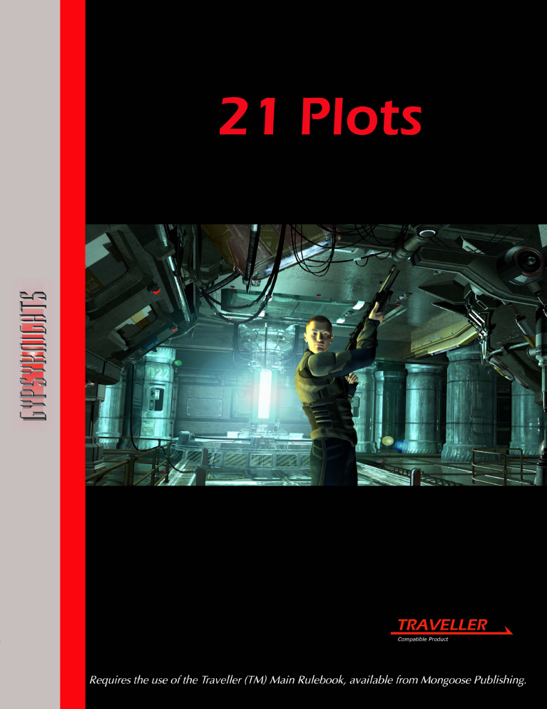
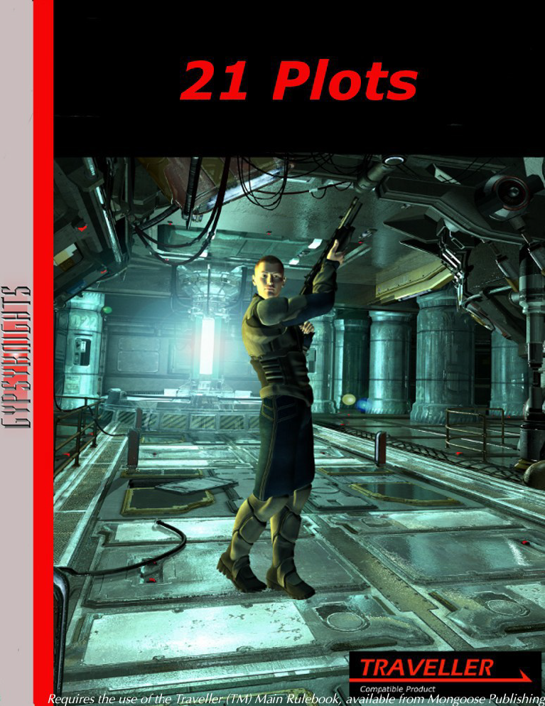
When seen face-on, you see a “clean” design, without a lot of decoration making it hard to read. The company name is written vertically in their distinctive font on a pink stripe along the left edge, bordered by a red stripe separating that from the rest of the cover. The remaining (main) portion of the cover is divided horizontally into thirds; the top third is black with red text naming the product in a sans-serif font, over a photo-render of an industrial setting, centered on a person who might be a mercenary carrying a long gun (a rifle or shotgun) at high port ready to bring it down and fire. The lower third is once again solid black, and the lower right corner carries the Traveller Compatible Product logo.
On Inspection
The title tells you exactly what to expect, and delivers exactly what it promises. There is a title page and a page ‘explaining’ what the product is up front, and a page of Open Game License at the end, but the ‘meat’ of the book is 21 adventure ideas, one per page, in the standard format that the Traveller community has come to call ‘Adventure Seeds’ and which have been ubiquitous in fan venues of all types. Each seed consists of a paragraph or two setting out the general idea behind the adventure, and six alternative outcomes, with the referee and the party left to develop the details. The seed instructions are to determine which alternative outcome is used randomly, but there is no compelling reason that a referee should feel obligated to do so; I would merely write “Possible directions to take this adventure:”, or perhaps suggest that the outcome can be selected “in any manner that seems good to the referee”. This, however, is a nit to which little effort should be devoted to picking.
Differences Between the Versions
 The
cover has been restyled; the original version’s company name and
separator stripe was somewhat thinner, and the artwork was the bottom
four-fifths of the cover, rather than just the middle third. The artwork
for both editions was taken from the same original; in the first
version, it was cropped a little on the left and right; in the second,
it was more heavily cropped from the bottom, so that the second version
cover art appears to be roughly the top half of the first version cover
art.
Internally, some of the text has been elaborated on in the second version, with additional descriptive material in both the setup paragraph and the list of possible outcomes. The page layout elements are also slightly more æsthetically pleasing in the second version. It should be noted that the original version did not claim a tie to GKG’s Quick Worlds and subsectors (as it predated most of them), but the tie in the second edition isn’t all that strong, and can easily be ‘edited out’ by the referee. Finally, the Open Game License is printed in a smaller font in the second version, so that the entire license fits on a single page (and makes the difference between the second version’s 24 pages and the first’s 26).
Overall, the second version should be considered preferable to the first version. Æsthetically, the minor differences in font selection and layout elements make a big difference; set side-by-side, the first edition looks more amateurish in comparison. More importantly, the more-elaborated text gives each of the seeds a little bit more ‘flavor’; while it doesn’t make any of them stand out, they are just that little bit less likely to garner the “Meh, it’s a seed” reaction.
Conclusion
There’s really little that can be done in one or two paragraphs to make any single seed stand out from the myriad of others—but then, the ultimate value of a seed is in what the referee and the party can do with it.
The chief value of this volume, and its similarly-named companions, is in the convenience of having a bunch of seeds handy, so that one can quickly get started on a session when there wasn’t a chance to pre-plan, or if part of your regular party can’t make it, or for a quick one-off at a con, or… For that purpose, the PDF is a good value (about $0.25 per seed) if one’s imagination is likely to get ‘stuck in neutral’, and a judgement call by the referee otherwise; the printed edition (about $0.50 per seed) is strictly a judgement call by the referee.
While I do not say that you should avoid purchasing this as a single item, my instinct is to wait for it to be part of a bundle at a discounted price.
 Freelance
Traveller